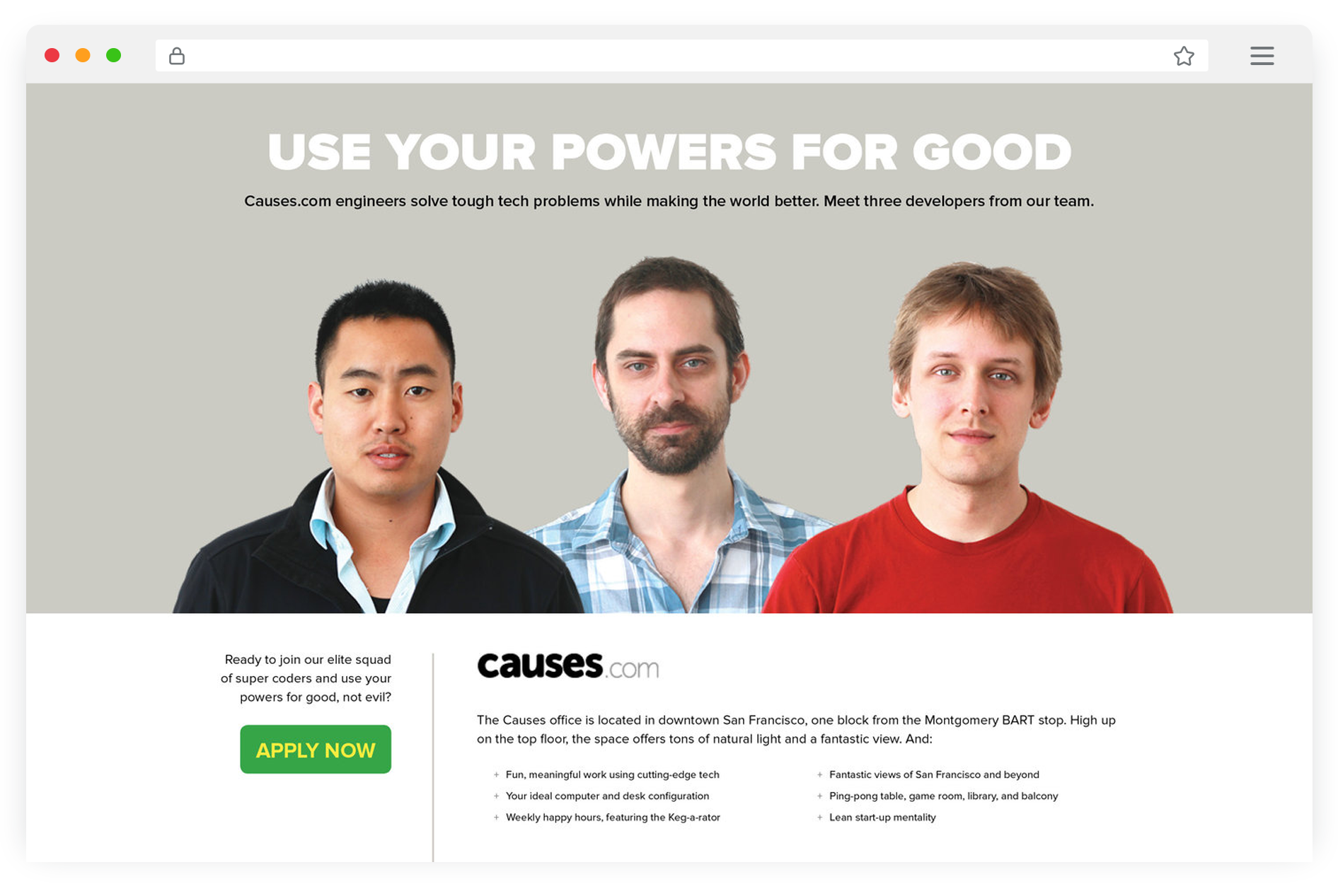
For this platform with 150 million users, my first project was concepting and designing a microsite to aid in the efforts of recruiting engineers. The goal was a user experience compelling and humorous—something more likely to be shared—to draw in as many applicants as possible.
This sufficiently reflected the warmth and humor of Causes' culture, and with top-tier candidates being in high demand, it helped differentiate us in the competitive arena of Silicon Valley recruiting.
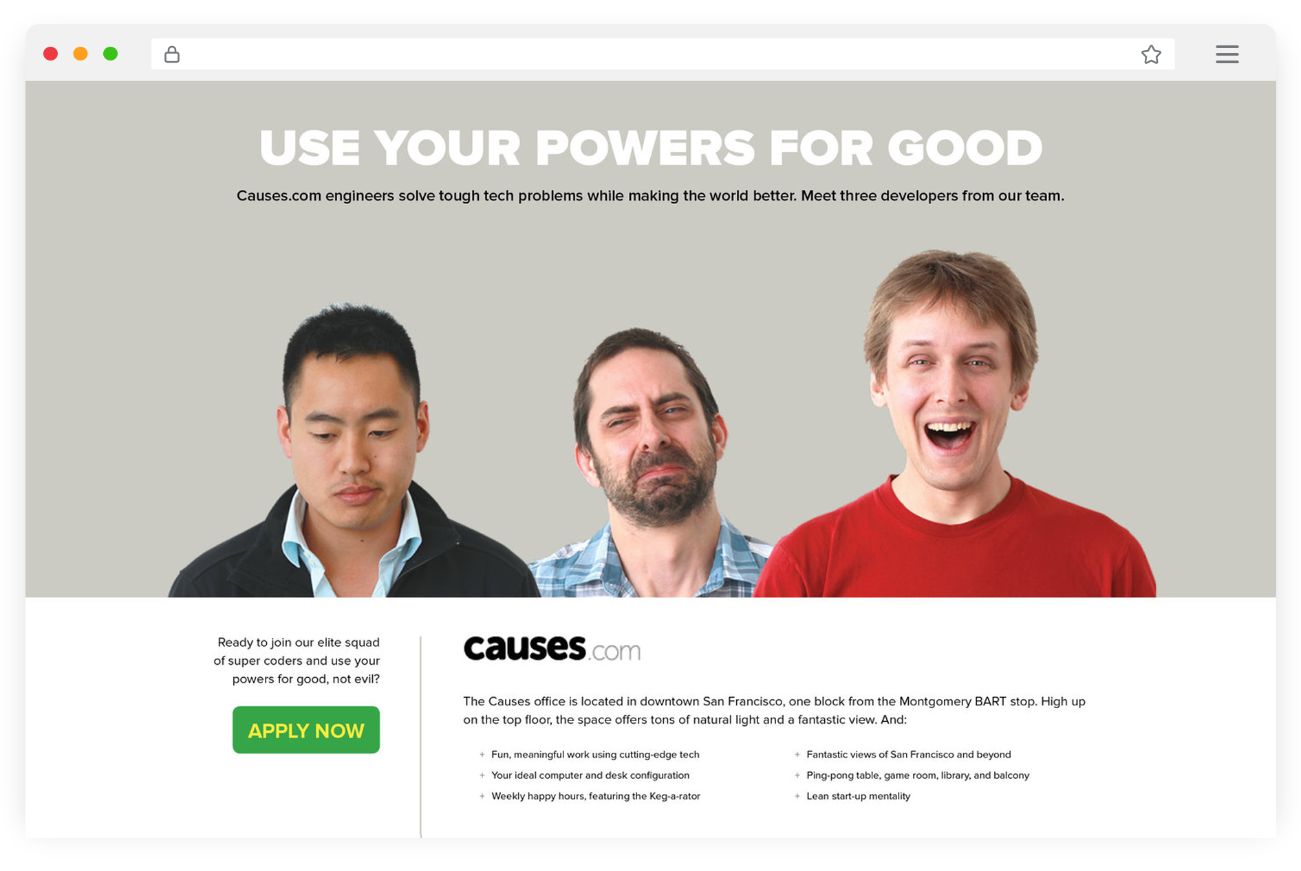
The final concept was an interactive experience where engineers would be presented as ambassadors through which candidates could learn more about Causes.
The hover state of one engineer would reflect his excitement at being chosen, while the two remaining would express their dismay.
The active state would see the remaining two recede while details about the primary engineer would be revealed showing both personal interests as well as their real-world impact via Causes as a product.
To make the application process as frictionless as possible—rather than redirecting the user to a third-party recruiting platform and forcing them to register for a new account or fill out lengthy forms—I designed a minimal, light-weight, in-page module.
We grew the team significantly, with some very strong engineers who eventually moved on to companies, including Facebook, Airbnb, Google, and Amazon.


