As the Art Director at BentoBox, one of my first tasks was an audit of the existing brand. I refined it by paring down some extraneous elements, and developed design systems for the shapes and illustrations to create a more holistic brand expression.
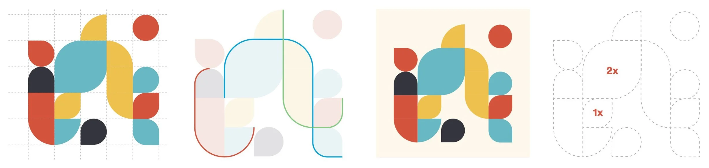
Illustrations were designed to be simple, geometric, and flat—ensuring the style is scalable, rather than relying on the idiosyncratic talents of a single individual. The aesthetic is also intentionally benign enough to work in harmony with the shapes.

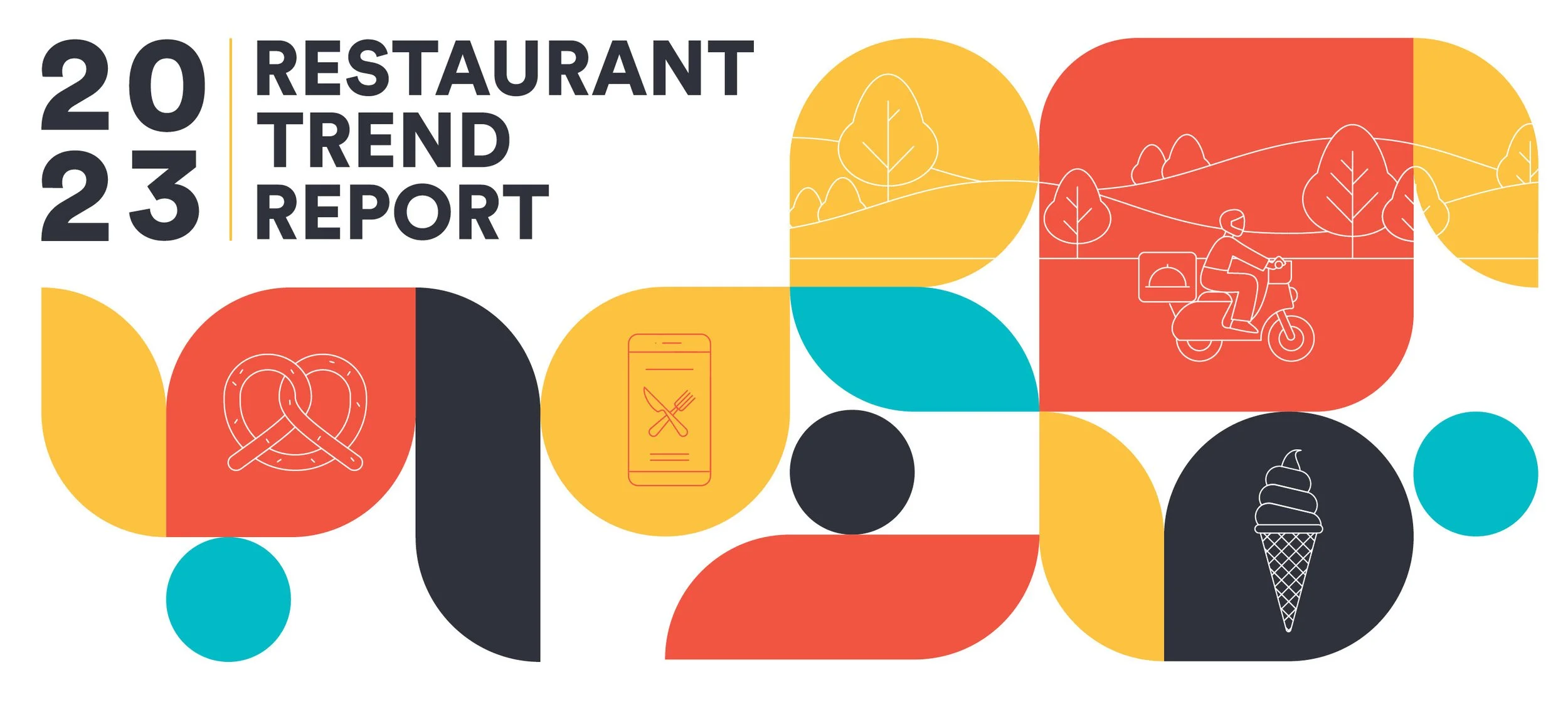
With the systems in place, the design team was able to apply the revised brand guidelines to marketing initiatives across all channels. Here are a few examples of a holiday campaign for paid social, which I concepted and art directed.

For our largest annual trade show, we used a 30’ tall archway to create an impactful experience for attendees as they entered. The interior of the arch featured this mural, telling the story of the product’s commerce and marketing capabilities, and the calm they bring to its users.

In addition to the brand work, I’ve also driven a lot of the UI/UX initiatives across our website, optimizing user flows that result in greater engagement and ease of use.
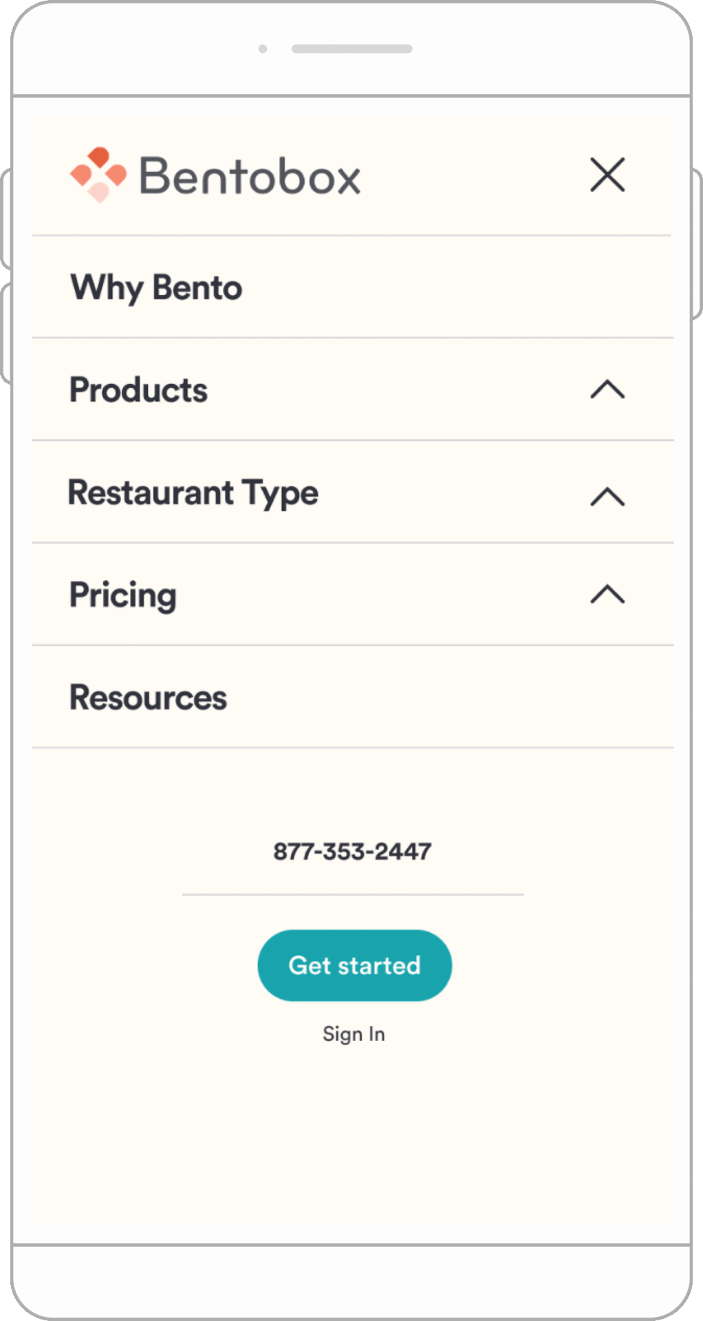
One of the more challenging projects was refining the site navigation, where the architecture had been defined by the priorities of a marketing team with no consideration given to user experience. I met this challenge head on, creating a scalable hierarchy that brought together an inconsistently-tiered navigation into a unified, intuitive experience.